
In this assignment, I will discuss how I applied the principles learned this semester and improved the Infographics in blog2.
An infographic is a collection of imagery, charts, and minimal text that gives an easy-to-understand overview of a topic. But excessive addition of elements in the poster will not bring any benefit to the readers, and it may make them confused. Pictures below are the updated poster and brochure:
Poster:

before 
after
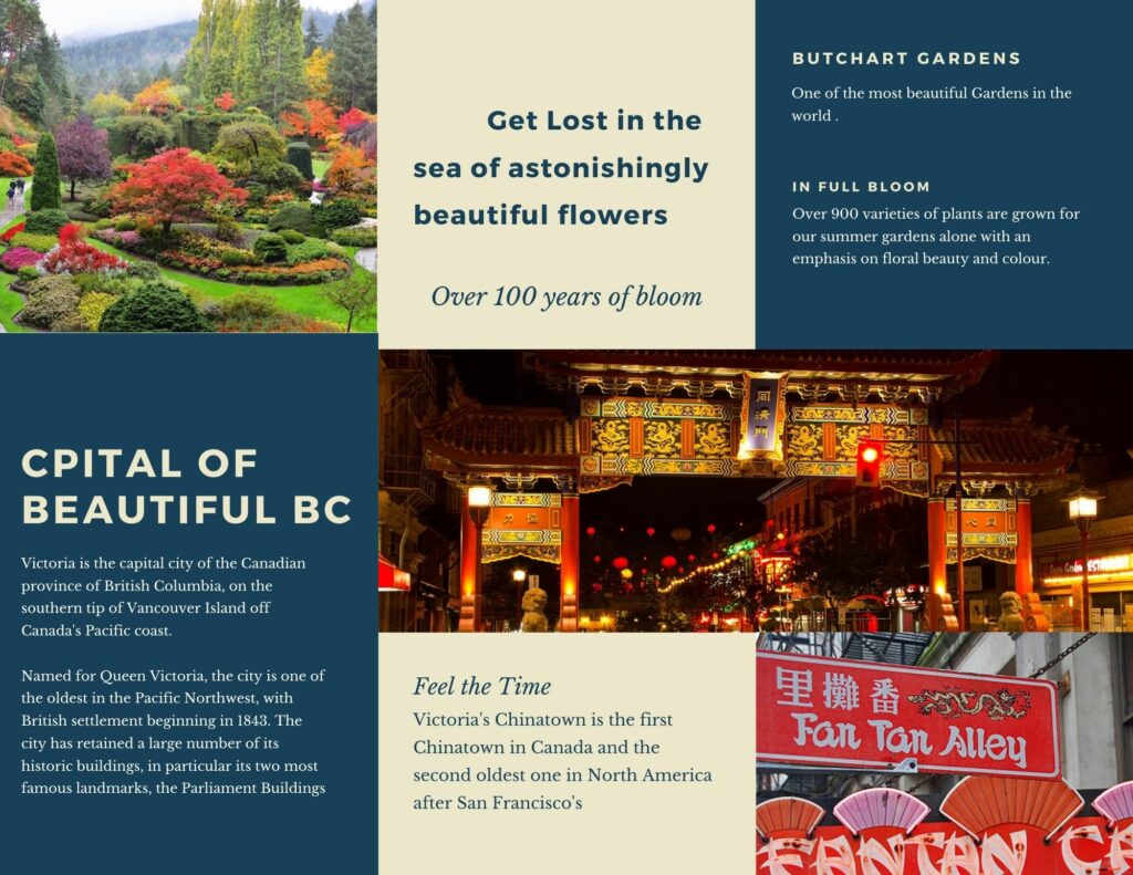
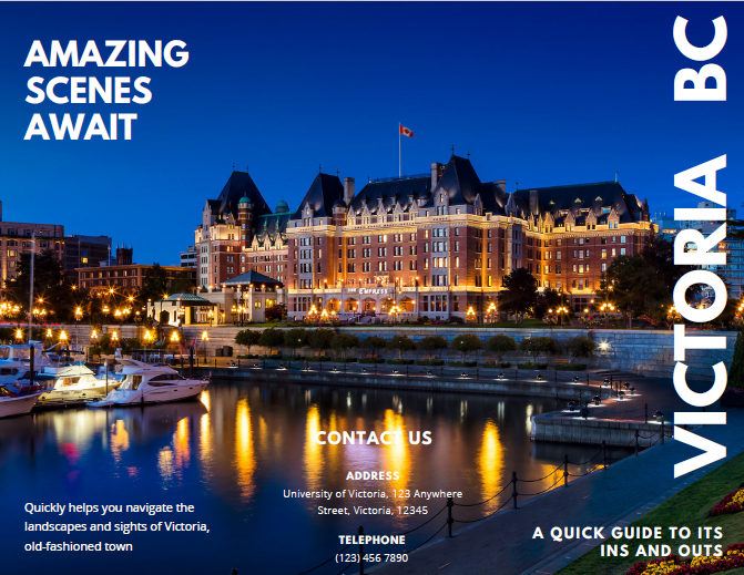
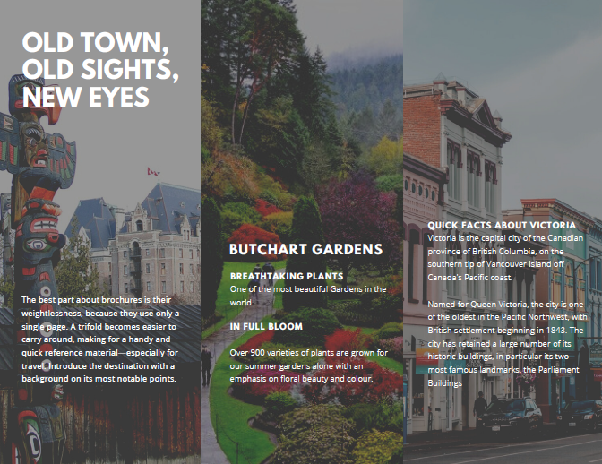
Brochure:

Principles of Multimedia Learning:
In the new poster and brochure design, I pay more attention to the Five Principles for Reducing Extraneous Processing and the dual coding principle. For a more direct description of the main concepts, for example, in the above poster, I used a huge picture of wearing a mask to emphasize it. One of the changes follows the Signaling Principle, people learn better when essential words are highlighted: I have highlighted the views of NO VIRUS, BUT LOVE in the poster and the title in the brochure to allow readers to receive the information I want to express more directly.
Next, I removed the design that has nothing to do with the content, The new design has a more structured layout with a clearer design that shows the different sections of the infographic. This change can be supported by the split-attention principle and the spatial contiguity principle.
Lastly, I want to talk about the application of the Redundancy Principle in the brochure. This brochure is divided into 3 individual parts, the narrations corresponding to each scenic spot are placed next to the portion of the graphic that they describe. It can help readers learn better about the attractions with the narration on the page.
Reference:
http://etec.ctlt.ubc.ca/510wiki/Cognitive_Theory_of_Multimedia_Learning
“The Cambridge Handbook of Multimedia Learning.” 2014, doi:10.1017/cbo9781139547369.